
Construction site safety posters only work when crews notice them, understand them, and connect them to the job in front of them. In Australia, that matters because construction accounted for 13% of all worker fatalities in 2023–24 while employing about 9% of the national workforce, according to Safe Work Australia figures referenced here. That gap is the clearest reminder that visual safety communication on site isn't a side issue.
Too many sites still treat posters as decoration. They go up at mobilisation, fade in the sun, get covered by notices, and stop doing any useful work. A proper poster program is different. It starts with risk, follows WHS obligations, supports supervision, and gets maintained like any other control.
Why Your Approach to Construction Site Safety Posters Needs an Urgent Rethink
Construction site safety posters should sit near the front of your risk communication system, not at the end of a procurement checklist. On a busy project, workers make hundreds of small decisions under time pressure. Posters help when they reinforce the right control at the right moment, in the right place.
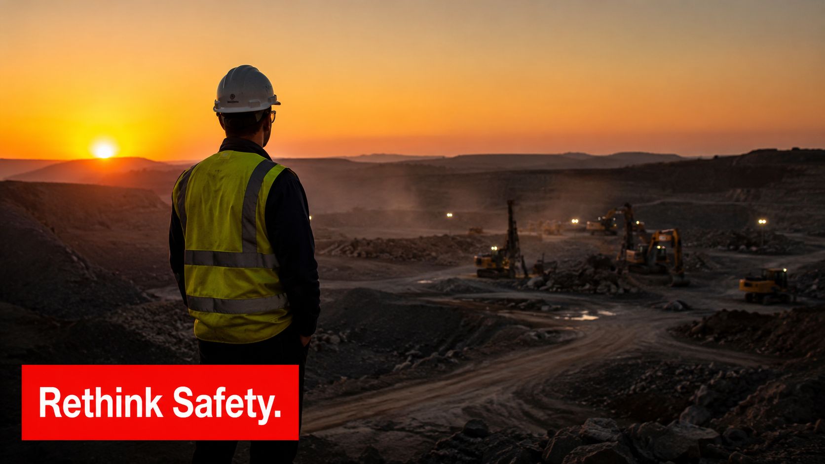
The problem isn't whether posters matter. The problem is how they're usually used. Sites often rely on broad messages, crowded noticeboards, and stale artwork that nobody reads after the first week. That approach creates the appearance of action without improving attention or recall.
What posters should actually do
A useful poster does one job well. It reminds a worker, supervisor, visitor, or subcontractor of a critical control just before exposure to risk. On a construction site, that usually means messages tied to plant movement, work at height, exclusion zones, PPE fit, temporary access, or public interface hazards.
Posters aren't a substitute for induction, SWMS, permits, pre-starts, or supervision. They are a constant visual reminder of controls already expected on site. Used properly, they support compliance and sharpen attention. Used poorly, they become wallpaper.
Practical rule: If a poster can't be understood in a few seconds from a realistic viewing distance, it won't influence behaviour on a live site.
The operational shift that makes the difference
The sites that get value from construction site safety posters treat them as part of a lifecycle system:
- Start with risk: Match poster topics to actual site hazards, not generic templates.
- Build around compliance: Separate required notices from behavioural reminders.
- Place with intent: Put messages at entry points, task zones, and decision points.
- Rotate regularly: Fresh material gets noticed. Old material disappears into the background.
- Check effectiveness: Link posters to toolbox topics, inspections, and observations.
That is the difference between signage that satisfies a file note and signage that supports safer work.
Building Your Poster Strategy on a Foundation of Compliance
Before ordering any artwork, sort out what your site must display and what your site should display. Those are related, but they are not the same thing. Mandatory notices and hazard signs deal with legal and operational requirements. Safety posters support communication, reinforcement, and safe choices around current risks.
Separate required signage from supporting communication
On most projects, required signs include warnings, prohibitions, emergency information, site rules, and access controls. Those need to be current, legible, and suited to the site layout. They form part of your formal compliance position.
Construction site safety posters do a different job. They reinforce a specific behaviour or control. A poster about dropped-object exclusion zones near a facade area is not the same as a mandatory warning sign. A poster reminding workers to check edge protection before starting roof work is not the same as a permit process. Good WHS management uses both, with clear purpose.
The practical mistake is blending everything into one cluttered board. Crews stop seeing the difference between a legal notice, a temporary direction, and a generic slogan.
Build poster topics from your real hazard profile
Poster strategy should follow the hazards that can seriously hurt people on your site. Start with your risk assessment, then narrow the messaging to a manageable set of focus hazards. If the project has active plant routes, suspended loads, scaffold interfaces, deep excavation, and public foot traffic, those issues deserve the visual space.
Use a simple messaging hierarchy:
- Critical risk message for the site or work stage
- One action the worker or supervisor must take
- One check to confirm the control is in place
That structure works far better than broad statements such as “work safely” or “zero harm starts with you”. Those phrases sound positive, but they don't tell anyone what to do next.
For teams building a broader compliance framework around site risk controls, Workplace safety in construction is a useful reference point because it helps place communication tools within wider site safety practice.
Include the people outside the fence
One of the most common gaps in construction site safety posters is audience selection. Posters often speak only to workers already inside the site. That ignores a major exposure at the boundary. Independent guidance notes that pedestrians near worksites face risks from excavations, unstable ground, and falling objects, as outlined in this article on construction hazards to the public, not just workers.
That matters on projects next to shops, schools, footpaths, roads, transport hubs, and occupied buildings. Public-facing poster content should support barricades, hoarding, wayfinding, netting, bollards, and traffic control, not compete with them.
Workers know the job is changing. The public usually doesn't. Your boundary communication has to bridge that gap quickly.
A practical planning checklist
Before approval, every poster topic should pass four tests:
- Relevance: Does it address a live hazard on this project?
- Audience: Is it for workers, supervisors, visitors, or the public?
- Timing: Is this the right message for the current stage of work?
- Control link: Does it reinforce an actual site control already in place?
If it fails any of those, don't print it.
Designing Posters That Command Attention and Drive Action
Design is where many construction site safety posters fall apart. The message may be correct, but the layout asks too much of the reader. On site, nobody stands still to study a crowded poster. They glance, filter, decide, and move on. Your design has to work in that reality.
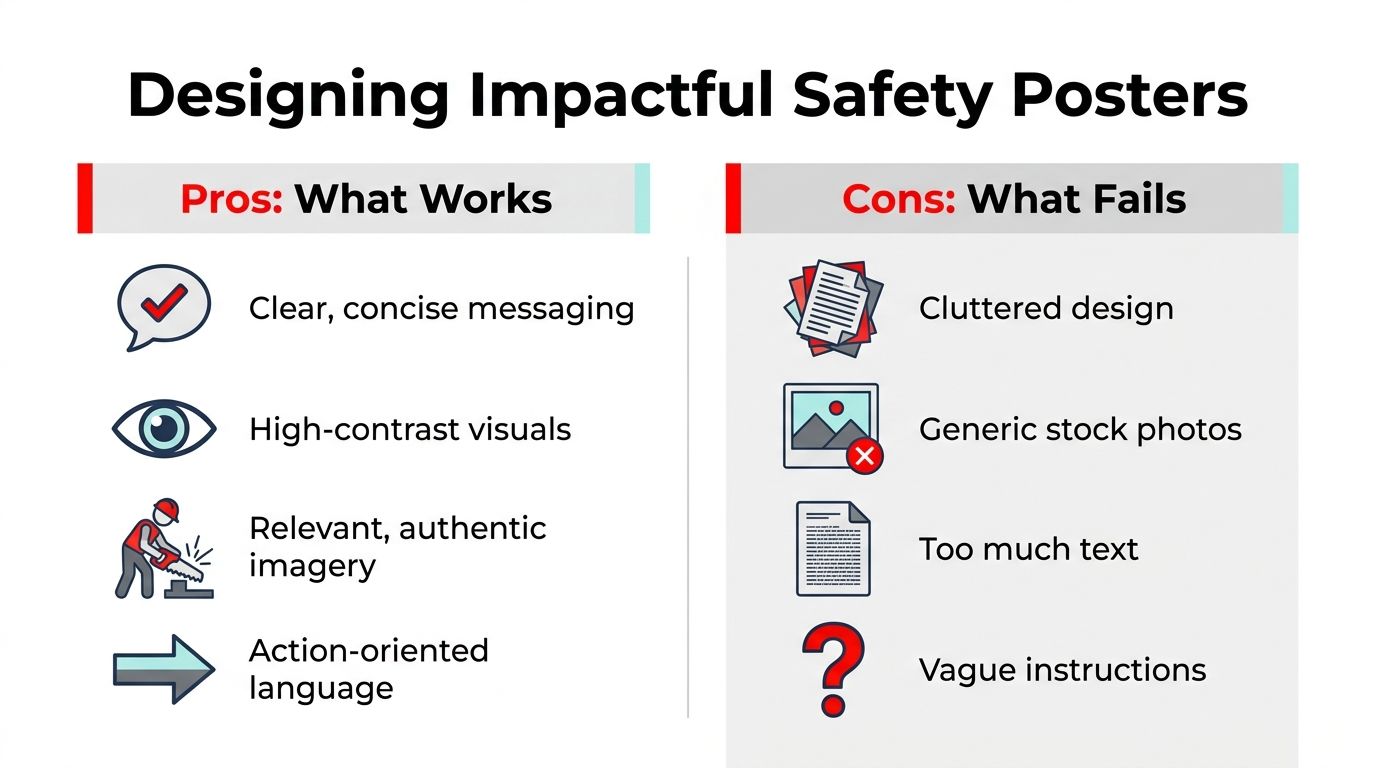
Australian construction safety data shows why content selection matters. Safe Work Australia data consistently identifies falls, being hit by moving objects, and vehicle interactions as dominant causes of serious injury, and generic “Be Safe” messaging has lower recall and impact than posters aimed at a single critical risk, as discussed in this analysis of construction safety focus hazards.
What good poster design looks like on site
A strong poster has a visual hierarchy that tells the eye where to land first. Usually that means:
- A short headline: Clear enough to read while walking past
- One main image or pictogram: Connected directly to the hazard
- One action line: Something observable, not abstract
- Minimal supporting text: Only what is needed to clarify the instruction
If the poster is about mobile plant, show the plant interaction. If it's about work at height, show the exact fall-prevention context. If it's about PPE, focus on fit, use, or inspection, not a catalogue of every item on site.
What fails in practice
The worst posters usually share the same problems:
- Cluttered layout: Too many icons, colours, and messages
- Tiny text: Legible on a laptop screen, unreadable on a fence
- Generic stock imagery: Doesn't look like the work people are doing
- Vague instructions: “Stay alert” doesn't tell anyone what to verify
That last point matters most. A site poster should lead to an action such as checking guardrails, confirming a spotter arrangement, inspecting a harness, or maintaining an exclusion zone. If there is no action, there is no operational value.
Keep each poster to one hazard, one action, and one expected check. Anything more and recall drops.
Design choices that improve comprehension
For mixed crews, subcontractors, and multilingual environments, visual clarity matters more than word count. Use authentic task imagery where possible. Use pictograms where the action can be shown easily. Keep contrast high. Put the key instruction at eye-catching size.
A few design decisions usually pay off immediately:
- Use familiar site language: Match the wording crews hear in pre-starts and toolbox talks.
- Choose task-specific visuals: Show scaffold, EWP, excavation edge, or loading zone, not a generic hard hat photo.
- Write active instructions: “Check exclusion zone before lifting” works better than “Lifting operations awareness”.
- Leave white space: Empty space is not wasted space. It helps the important part stand out.
If you're briefing a designer or print supplier, give them photos of the actual work environment, your approved terminology, and the single behaviour you want reinforced. That usually produces a far better result than asking for a “safety poster about hazards”.
Procuring Durable and Fit-for-Purpose Safety Posters
A damaged poster sends the wrong message. It tells the workforce that the site tolerates faded information, weak maintenance, and stale communication. On exposed construction projects, procurement choices matter just as much as content.
Recent industry reporting highlighted a 2026 development where a new weather-resistant consolidated construction compliance poster was launched to simplify required notices and improve durability, signalling demand for signage that can handle outdoor conditions and changing compliance needs, as reported by OHS Online. That doesn't mean one product solves everything. It does show where the market is heading.
Choose material based on location, not habit
Some sites buy the same substrate every time because that's what the last project used. That's a procurement shortcut, not a risk-based decision. Materials should be selected by exposure, mounting method, expected life, and whether the message will be temporary or semi-permanent.
Here is a practical comparison.
| Material | Best For | Durability | Cost |
|---|---|---|---|
| Corflute | Short-term internal or sheltered site messaging | Moderate in protected areas | Low |
| PVC board | Indoor notice areas and longer-use displays | Good for sheltered use | Moderate |
| Vinyl sticker | Plant, doors, temporary barriers, smooth surfaces | Varies by surface and exposure | Low to moderate |
| Aluminium composite | External high-exposure zones and long-term site boards | High | Higher |
Match the substrate to the message life
Corflute is easy to install and replace, so it's useful for changing campaigns in lunchrooms, site sheds, and temporary internal partitions. Vinyl works well when the message belongs on a physical object, such as a gate, cabinet, barrier, or access point. Aluminium composite is usually the better call for perimeter boards or exposed locations where sun, dust, and weather will punish cheaper material.
If the poster has to survive months of outdoor exposure, don't treat it like a noticeboard printout. Specify weather resistance, UV stability, and a mounting method that won't let corners curl or fixings fail.
Procurement details that reduce rework
Small specification errors create avoidable problems on site. Before sign-off, check:
- Mounting surface: Hoarding, mesh fence, trailer wall, plywood, steel panel, or internal board
- Viewing distance: Near-field instruction needs different sizing from a perimeter sign
- Cleaning needs: Dust, mud, splash, and abrasion all affect readability
- Revision control: The printed version should match the current approved message
For larger temporary site assets, branded communication surfaces can also support safety messaging when handled properly. This construction trailer wraps guide is a useful example of how large-format surfaces are planned and applied, even though the same discipline should still be filtered through WHS requirements and message control.
Don't let procurement dilute the message
Buying bundled poster sets can be convenient, but they often include generic topics that don't match the site. It's better to order fewer pieces that are relevant than fill every wall with material nobody needs. Fit-for-purpose always beats bulk.
Strategic Placement for Maximum Visibility and Impact
Placement is where construction site safety posters either become useful or disappear into the background. The right message in the wrong location fails. The same poster placed at the point of decision can change what happens next.
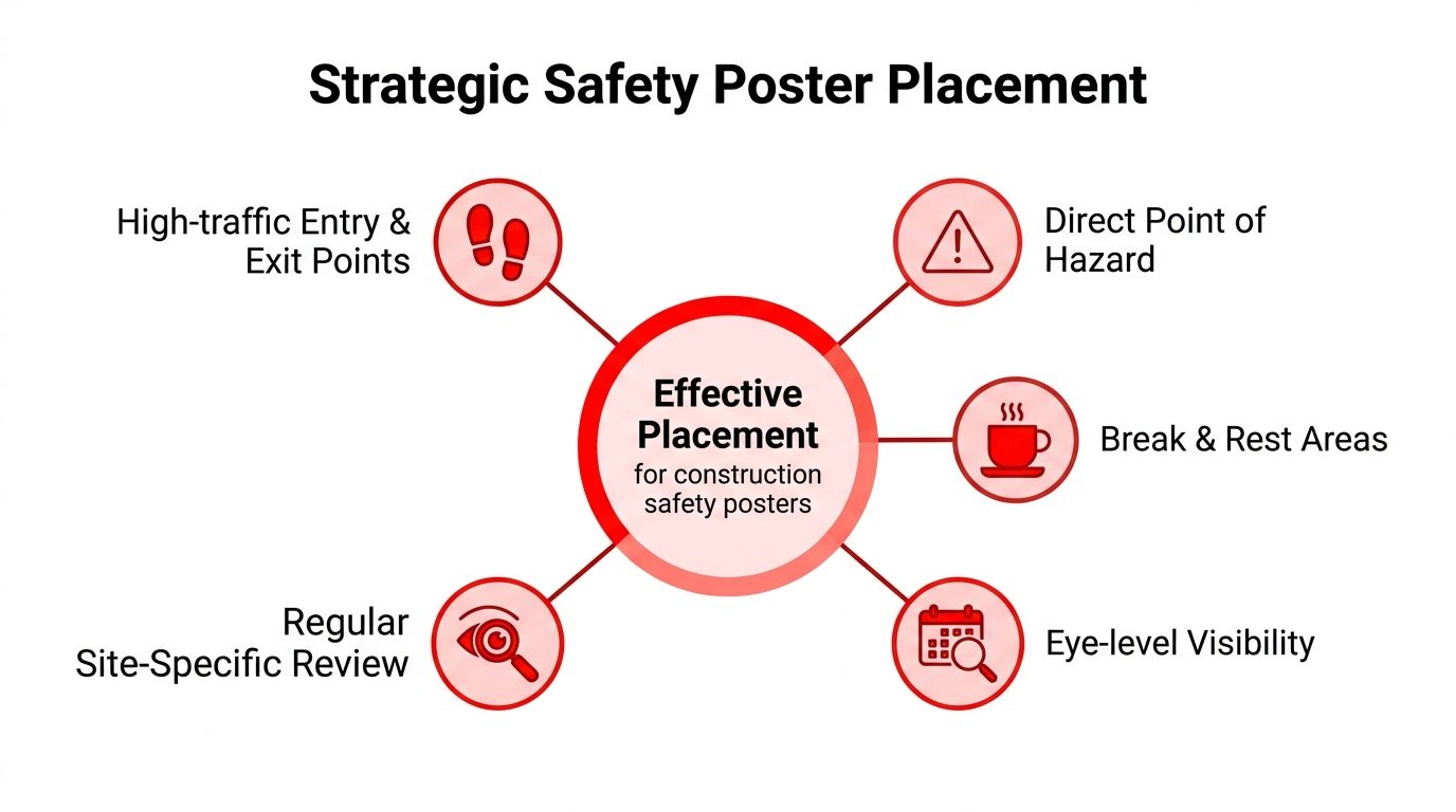
Best-practice guidance treats posters as a leading-indicator communication control and recommends placing them in high-traffic, decision-point locations such as site entries, lunchrooms, tool sheds, hoists, and permit-to-work areas, with concise, high-contrast messaging and regular rotation to avoid fatigue, as outlined in this guidance on getting safety posters noticed.
Walk the site like the worker does
Start at the gate. Entry signage should set the baseline. Site rules, PPE, traffic flow, emergency information, and any current critical campaign belong where people transition from public space to controlled work area.
Move next to the sign-in point, permit station, or pre-start area. In these locations, posters can reinforce today's active risk before the task starts. If lifting operations are planned, a lifting-zone poster belongs there. If facade access is changing, that message needs to sit where crews collect permits or instructions.
Then follow the work fronts. Near scaffold stairs, hoists, crane access paths, loading zones, temporary stairs, and plant crossings, posters should support the next decision, not summarise the whole safety system.
Good placement versus bad placement
A fall-prevention poster in the lunchroom can reinforce a toolbox talk. That's useful. The same poster hidden behind notices near a scaffold handover point is poor placement if workers need the reminder at the access point.
A vehicle interaction poster near a pedestrian crossover, spotter station, or site logistics board is strong placement. The same message pinned in the amenities block may still be seen, but it won't shape behaviour at the moment of exposure.
Put the message where someone can still do something about it.
The site map method
One practical way to place construction site safety posters is to mark them on the site logistics plan. Identify:
- Entry and exit routes
- Worker congregation points
- Permit and authorisation areas
- High-risk interfaces
- Public boundary zones
Then assign each poster a clear purpose. Some are for orientation. Some are for reinforcement. Some are for hazard-specific prompts at the workface.
Avoid poster blindness
Workers stop seeing material that never changes. They also stop seeing posters hidden in visual clutter. Keep them at eye level where possible, maintain clear sightlines, and avoid stacking multiple competing messages in the same field of view.
If one noticeboard has induction material, HR notices, environmental alerts, site maps, and six safety posters, you've created a reading task instead of a safety prompt. Split the content across locations and keep each board purposeful.
A Living System Maintenance, Rotation, and Measuring Impact
A poster program that isn't maintained becomes self-defeating. Crews notice neglect. If the corners are peeling, the colours are washed out, or the topic is months out of date, the message loses authority. That's why construction site safety posters need an owner, a review cycle, and a link to the wider WHS system.
Maintenance is a site discipline
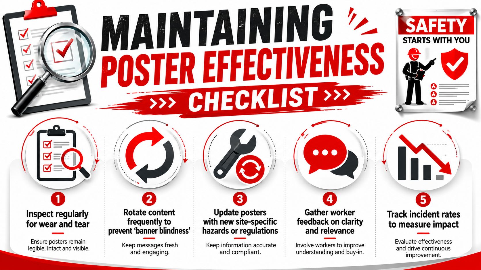
Posters should be checked the same way other site communication tools are checked. During regular inspections, look for damage, dirt, fading, outdated wording, missing fixings, and blocked sightlines. If a poster is no longer readable or relevant, remove or replace it. Leaving it in place sends a poor signal about standards.
A simple maintenance routine usually works best:
- Inspect condition: Check legibility and physical damage during routine site walks.
- Clean where needed: Dust and mud can make even a well-designed poster useless.
- Remove duplicates: Too many repeated messages create fatigue.
- Replace outdated items: Especially after staging changes, revised access, or altered work zones.
Rotate the message before people tune it out
Best-practice guidance recommends rotating poster content at least monthly and aligning it with toolbox talk topics so workers encounter the same control through more than one channel. That approach matters because fatigue sets in when the same image sits on the wall too long, and posters should reinforce, not replace, the PCBU duty to provide information, instruction, training and supervision. That principle is explained in the earlier guidance already cited.
Monthly rotation is practical because it fits site rhythms. It is long enough to support reinforcement and short enough to keep the visual environment active. On fast-moving projects, some workface posters may need changing sooner if the risk profile shifts.
Tie each poster cycle to a real site activity
The best poster programs are tied to work, not calendar reminders. If this month's focus is exclusion zones around mobile plant, the same theme should appear in:
- Toolbox talks
- Supervisor observations
- Pre-start reminders
- Walkthrough inspections
- Corrective action follow-up
That repeated exposure builds recognition. It also gives supervisors something concrete to verify on the ground.
A poster on its own rarely fixes anything. A poster linked to briefing, observation, and verification can sharpen site performance.
Measure whether the program is doing its job
You don't need a complicated dashboard. You do need a way to tell whether the poster system is active and relevant. Good checks are usually operational, such as whether the current poster matches the current hazard, whether supervisors are using the same language in toolbox talks, and whether site observations show the expected control being checked.
Useful indicators can include:
- Observation completion: Are supervisors checking the linked control?
- Toolbox alignment: Does the posted message match the live briefing topic?
- Hazard close-out discipline: Are issues related to the focus hazard being actioned promptly?
- Worker feedback: Can crews recall the message and the required action?
If you can't answer those questions, the poster program probably isn't being managed. It's just hanging there.
Frequently Asked Questions about Construction Site Safety Posters
How often should construction site safety posters be changed?
As a working rule, rotate them at least monthly and sooner if the work stage or hazard profile changes. A poster about excavation edge protection has little value once that activity has finished and the site has shifted to facade installation or internal fit-out.
Should posters replace toolbox talks or supervisor instructions?
No. Posters reinforce. They don't replace. On Australian sites, the primary duty still sits with the PCBU to provide information, instruction, training and supervision. A poster can support that duty, but it can't carry it on its own.
What should a construction site safety poster focus on?
Keep it tight. One critical risk, one expected action, and one check. Messages built around live site hazards work better than broad slogans because workers can connect them to a task or condition they recognise immediately.
How do you handle multilingual workforces?
Use plain English, consistent site terminology, strong pictograms, and authentic visuals. If a workforce includes multiple language groups, test the draft with supervisors and crew representatives before printing. If people interpret the image differently from what you intended, redesign it.
Are digital screens better than printed posters?
Sometimes. Digital boards can be useful in controlled areas such as site offices, induction rooms, or crib rooms where power, glare, and viewing time are manageable. They are less reliable in rough external conditions unless the hardware is designed for that environment. Printed posters still have one big advantage. They can be placed exactly where the hazard decision happens.
Where should posters go first on a new project?
Start with the gate, sign-in or permit area, amenities, and the highest-risk work interfaces. After that, adjust placement around traffic flow, changing work fronts, and public boundary exposure.
Can generic template packs work?
Only if they are filtered through your actual site risk. Generic packs often include topics that don't match the project and miss the hazards that matter most. Edit heavily. A smaller, sharper set is usually more effective.
How do you know if workers are actually noticing them?
Ask directly during pre-starts and site walks. Pick one current poster and ask a worker what it means, what action it requires, and where that hazard exists on site. If the answer is vague, the issue may be the content, placement, or lack of reinforcement from supervision.
What is the biggest mistake with construction site safety posters?
Treating them as fixed wall art. Once a site stops reviewing, rotating, and checking them, the program loses force. Good posters are active controls in the communication system. Bad ones become background noise.
If you need support securing site access, managing gatehouse control, protecting plant and materials, or strengthening overall risk management around a live project, GM GROUP Services provides specialized security support for construction environments across Australia. Their teams work with site managers on practical, fit-for-purpose protection that helps keep people, property, and operations safe.
Discover more from GM Group Services
Subscribe to get the latest posts sent to your email.